My family gave me my first camera when I graduated from college. I’m not sure why they gave it to me as I had not shown any interest in photography up to that time. I was a Theater major and made short silly films with my buddy Jonny on our designated film nights. I was definitely the creative type but hadn’t found a voice yet.
So, I took that camera on a six week journey across the United States and fell in love with directing the still moment. The camera was natural in my hand and my eye immediately sought out strong visions. I think I had shot about 60 rolls of film by the time I got to the Grand Canyon – and I ran out of film. So I strolled into the gift shop, but all they had was black and white film. Geesh, were my images going to look like expressionistic silent films now?
Well, when I finally got my 80+ rolls of film back from the lab it was the black and white that struck me the deepest. It was a new way to see the world and I was addicted. I shot 90% B&W for the next ten years and I feel that by doing that, my composition thought process was strengthened. B&W lends itself to a very graphic and/or documentary style of work. We are influenced by the shadows instead of the colors. Texture and contrast are easily enhanced. Black and White is the true 50 Shades of Grey!
Looking back at my last few years of work I realize I have become more of a color shooter. Those graphic nights are now filled with blues and oranges battling for power. When shooting digital, I always capture RAW color in-camera. I then decide how to process it when I get home to my Lightroom. Some I definitely know will be B&W and I compose accordingly. Others I don’t know until I start developing. My rule of thumb is if the color isn’t playing a major role in the story then consider stripping it out. Either way, it should be a decisive choice.
Below are some examples of what the images look like in both color and black and white – I’ll walk you through my thought process.
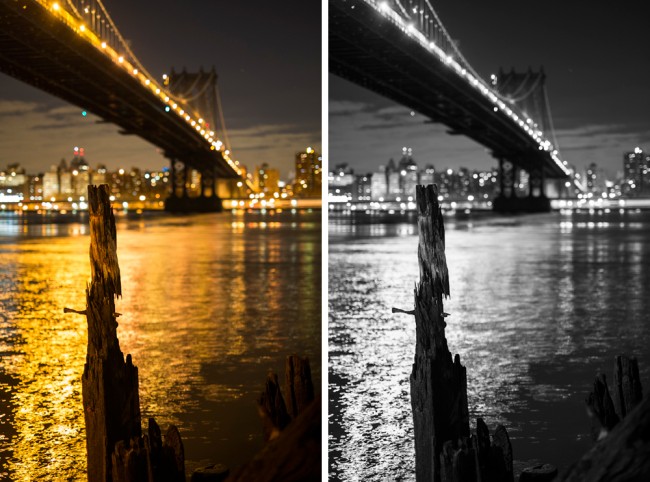
For this image I was first drawn to the gold reflecting on the river. I wanted to enhance the color further by shooting at a shallow depth of field. This created a very pleasing bokeh background of colors and shapes. The focal point is the solid remnant of the pier playing against the movement of the currents. I only saw it as a color image but it isn’t bad in B&W, the color turns into a pleasing highlight contrast and there is a timeless quality to it. Feel free to click on the images to get a larger look.
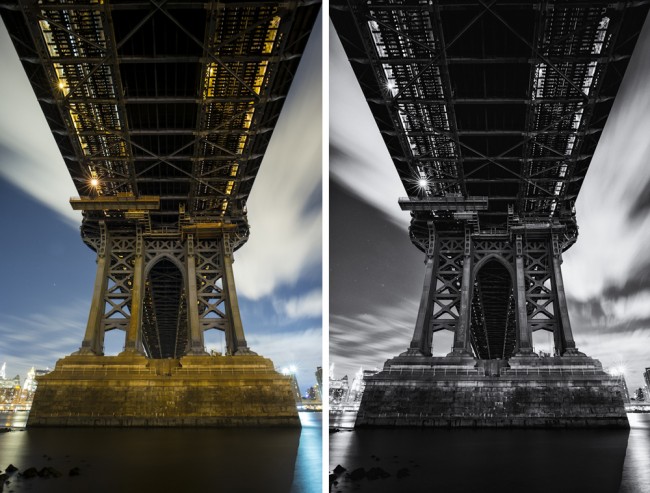
I immediately saw this Under the Manhattan Bridge image in B&W. Steel and stone always look stronger in black and white and it enhanced the overall structure of the scene. The pleasant surprise was how it also gave more separation/movement to the clouds. The stars on the left hand side are also easier to see on this moonless night.
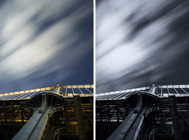
 In the last image I was drawn to the quickly moving clump of clouds and wanted to play them in an abstract way against the bridge. Again I don’t mind the color – in fact I like the yellow light on the main cable lines. However it is easier to influence the contrast and detail in black and white and it lends itself to this image even more.
I really enjoyed this exercise. It reminded me to be more thoughtful of the entire process of seeing. Look purposefully for color and compositions that will lend themselves to black and white.
Which versions do you like and why?


well you know it is all in the family as your grandfather was a photographer in the very old school style and passed that on to you. you just had to find it. your work is very creative. l do remember all of your college films!!!! love mom
Thanks Don! The first camera was a Pentax IQ zoom, which was a darn good point and shoot at the time. Unfortunately, I used and abused it too much and had to replace it with the Pentax K1000 about a year later. We should definitely compare collections – I’m up to 40+ now with a focus on the 1950’s. Stay tuned to the blog – starting in January I plan on reviewing all my classic cameras!
Gabriel,
It was great meeting you at Barnstorm! I really enjoyed viewing your web site, excellent work! As a accidental collector of old cameras, I’m curious about your first camera, what was it? Also do you still have it?
-Don Henderson
Angus, you are one of the few people who knew me when I was camera-less!
Thanks for sharing what you see and why. I am very intrigued with how we see the world in so many different ways.
I’m with you on these images…all the little details in the last two shots are brought out even more in B&W.
Ya, 80 rolls in 6 weeks of driving across country – I jumped in headfirst!
Hey Gabe,
I didn’t realize your origin story. That’s great. I thought you were bitten by a radioactive camera.
I REALLY like the color of the first pic. That gold is dreamy. I also dig the lights on the bridge, and the random red or green dot. Lots of dancing. The color makes it easier to see the pier, which gets a little lost in the background in the b+w, especially at the top of the pier, which almost looks like an owl. The black and white does add an austere solemnity, though.
The other two pics look way more dramatic in b+w. The white clouds VS the black, unlit sections of the bridge underbelly is severe, powerful. Gothic. Esp the third pic: The lines of the grid deck. The grey concrete, with hard lines, contrasting the grey clouds, with soft, washed out texture. The stark, white support running horizontally between the deck and clouds. Man VS nature.
Ha. You STARTED with 80 rolls of film? You crazy.
Love,
A~